Building Energy Boot Camp 2019 - Day 1

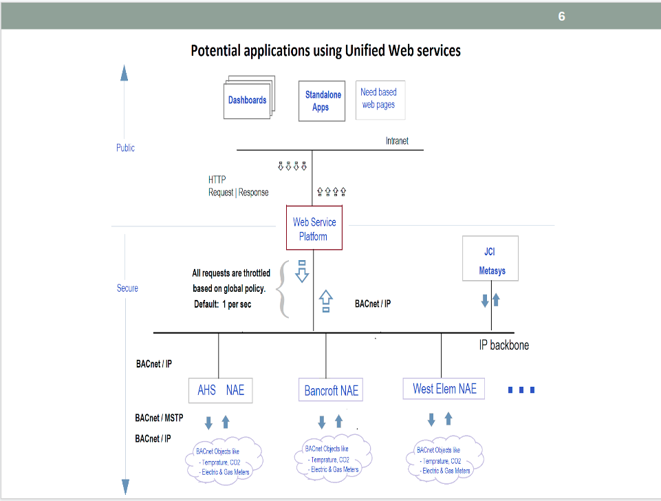
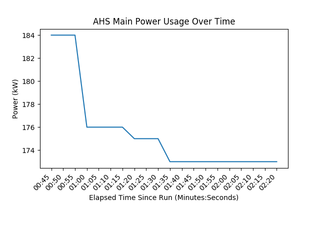
Today marked the first day of the Energize Andover Building Energy Boot Camp. We unfortunately began our day by fixing the problems half of us had with our internet, and learned that the problems were caused by policies on the network. Once everyone was connected, several informative presentations were given, covering everything from the pandas package to the infrastructure behind our BACnet data server. To end the day, we began experimenting with matplotlib to make a line graph with live power data. You can find my code and results at the end of this post.
Images
.png)

Code and Output
The following is a screenshot of my completed live line graph:

The code used to achieve this output:
import os
import pandas as pd
import matplotlib.pyplot as plt
import matplotlib.animation as animation
import numbers
from building_data_requests_external import get_value

# Read spreadsheet into a dataframe.
# Each row contains the following:
#   - Label
#   - Facility
#   - Instance ID of electric meter
df = pd.read_csv(os.path.join('..', 'csv', 'ahs_power.csv'))

# Choose row
main_row = df[df['Label'] == 'Main (kW)']

# Create figure for plotting
fig = plt.figure()
ax = fig.add_subplot(1, 1, 1)
xs = []
ys = []

# How many times animate() has been called, starts
updates = 0


# This function is called periodically from FuncAnimation
def animate(i, xs, ys):
    global updates

    # Calculate minutes and seconds from updates
    sec = 5 * updates
    minutes = 0

    while sec >= 60:
        sec = sec - 60
        minutes = minutes + 1

    value, units = get_value(main_row['Facility'], main_row['Meter'], live=True)
    value = int(value) if isinstance(value, numbers.Number) else ''
    units = units if units else ''

    # Add x and y to lists
    xs.append('{:02d}:{:02d}'.format(minutes, sec))
    ys.append(value)

    # Limit x and y lists to 20 items
    xs = xs[-20:]
    ys = ys[-20:]

    # Draw x and y lists
    ax.clear()
    ax.plot(xs, ys)

    # Format plot
    plt.xticks(rotation=45, ha='right')
    plt.subplots_adjust(bottom=0.30)
    plt.title('AHS Main Power Usage Over Time')
    plt.ylabel('Power ({0})'.format(units))
    plt.xlabel('Elapsed Time Since Run (Minutes:Seconds)')

    updates = updates + 1


# Set up plot to call animate() function periodically (every 5 seconds)
try:
    ani = animation.FuncAnimation(fig, animate, fargs=(xs, ys), interval=5000)
    plt.show()
except KeyboardInterrupt:
    print("Shutting down...")
    exit()